Article: Your Guide to Choosing the Perfect Artwork Colour Palette
Your Guide to Choosing the Perfect Artwork Colour Palette
Choosing the right artwork for your space is about more than just picking something you like—it’s about creating harmony and balance in your home. One of the most important factors in achieving this is colour. The colours in your artwork can set the tone for the entire room, influence the mood, and tie your decor together. In this guide, we’ll walk you through how to choose the perfect artwork colour palette for your space, and how tools like mood boards can make the process easier and more fun.
Why Colour Matters in Artwork
Colour is one of the most powerful tools in interior design. It can evoke emotions, create focal points, and even make a room feel larger or cozier. When it comes to artwork, the colours you choose can either complement your existing decor or become the inspiration for an entirely new look. Here’s how to make colour work for you:
1. Complement Your Existing Colour Scheme
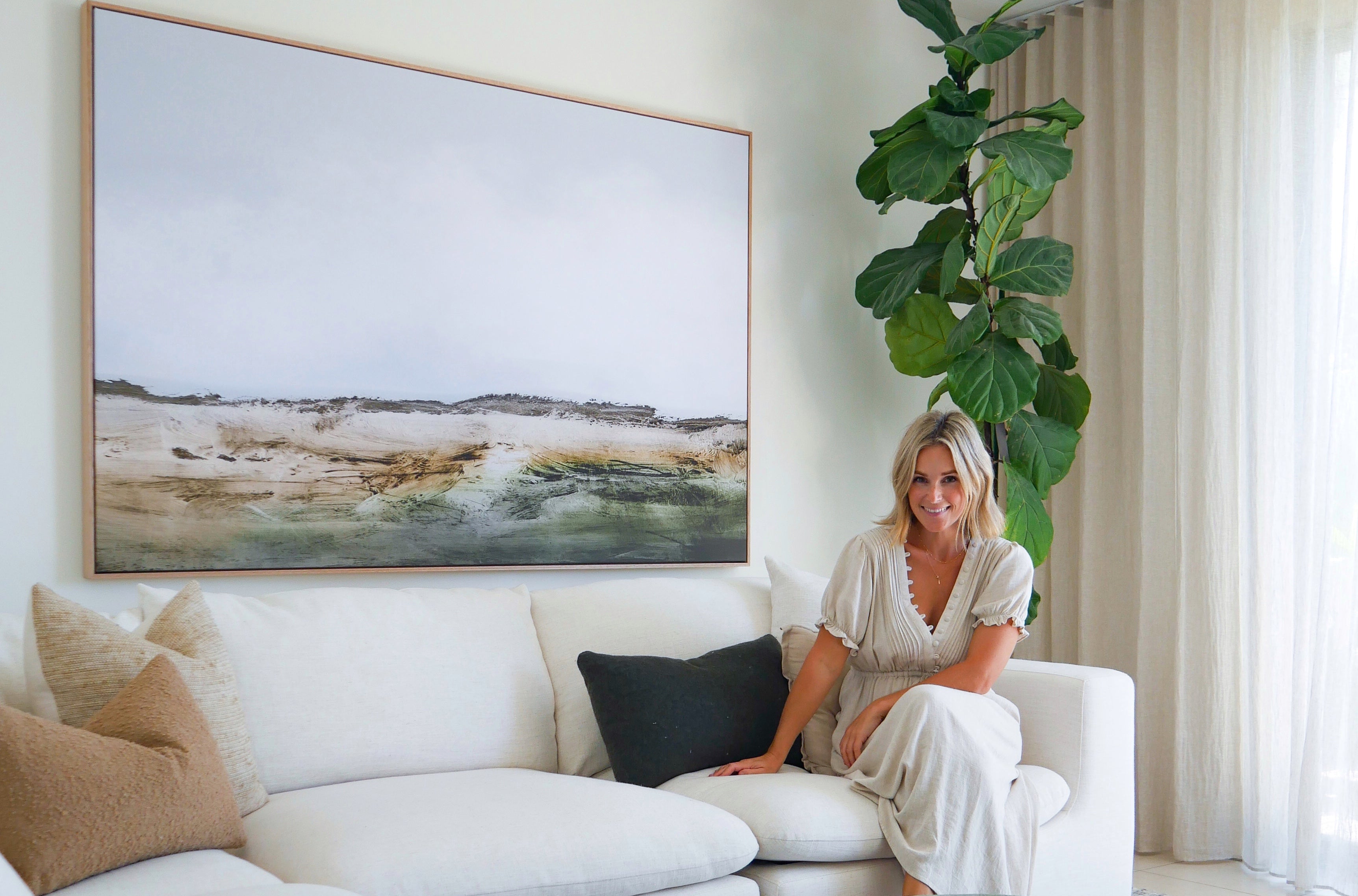
If your room is already furnished and decorated, the easiest way to choose artwork is to find pieces that complement your existing colour palette. Look at the dominant colours in your furniture, walls, and accessories, and select artwork that incorporates those tones. This creates a cohesive, harmonious look that feels intentional and polished.
Example: If your bed room features soft creamy and warm neutral colours, consider artwork with similar tones, such as an abstract floral piece with warm neutral colours that ties everything together.

2. Build Your Decor Around the Art
If you’re starting with a blank canvas—or if you’ve found a piece of art you absolutely love—you can use the artwork as the inspiration for your entire room’s colour scheme. This is a great way to create harmony, personalised space that reflects your unique style.
Example: If you fall in love with an abstract artwork featuring shades of dark blue and brown, you can incorporate those colours into your furniture, cushions, or accessories to tie the room together.

3. Create Contrast
Colour can be used to create different effects in your space. For a harmonious, calming vibe, or cheering up choose artworks with colours that bring in the vibes you want for the space . If you want to make a bold statement, opt for contrasting colours that pop against your walls or furniture.Example: A bright colourful piece of art can add a striking focal point to a room with neutral tones or plain colour, while a monochromatic black-and-white photograph can add sophistication to a modern space.

4. Use a Mood Board to Visualise Your Colour Palette
One of the best ways to ensure your artwork complements your space is by creating a mood board. A mood board allows you to experiment with different colour combinations, textures, and styles before making a final decision. Here’s how to use a mood board to choose the right artwork:

Step 1: Gather Inspiration
Start by collecting images of your existing furniture, decor, and wall colours. You can also add fabric swatches, paint samples, and photos of artwork you love.
Step 2: Experiment with Colour
Use the mood board to test how different colours interact. For example, place a photo of a potential artwork next to your wall colour and furniture to see if the tones complement each other.
Step 3: Refine Your Choices
A mood board helps you narrow down your options and ensures that the artwork you choose fits seamlessly into your space. It’s a great way to avoid costly mistakes and make confident decisions.
Pro Tip: We have an inspiring Mood Board page where we share mood boards with Gioia's artworks. Many online tools and apps, like Canva or Pinterest, make it easy to create digital mood boards. Simply upload images of your space and potential artwork to see how everything works together. There is another tool used widely by interior designers and lovers is Style Sourcebook.
5. Popular Artwork Colour Palettes and Their Effects
Here are some popular colour palettes and the moods they create:
- Monochromatic: Black-and-white artwork adds sophistication and timeless elegance to any

- Earthy Tones: Warm browns, greens, and beiges create a cozy, natural feel, ideal for rustic or bohemian interiors.

- Bold and Bright: Vibrant colours like red, yellow, and blue can energise a room and make it feel more dynamic.

- Soft Pastels: Light pinks, blues, and greens bring a calming, serene vibe, perfect for bedrooms or reading nooks.

6. Tips for Choosing the Right Artwork Colour Palette
- Consider the Room’s Purpose: Think about the mood you want to create in the room. For example, calming colours like blues and greens work well in bedrooms, while energising colours like reds and yellows are great for living areas or kitchens.
- Test Before You Commit: If possible, bring home samples or use digital tools to see how the artwork looks in your space before making a purchase.
- Don’t Be Afraid to Experiment: Art is a reflection of your personality, so don’t be afraid to choose colours that speak to you, even if they’re unconventional.
Ready to Find Your Perfect Artwork Colour Palette?
Choosing the right colour palette for your artwork doesn’t have to be overwhelming. By considering your existing decor, experimenting with mood boards, and thinking about the mood you want to create, you can find the perfect piece that enhances your space and reflects your personal style.Explore our curated collections at Gioia Wall Art and use our colour filters to find artwork that matches your ideal palette. Whether you’re looking for bold, vibrant pieces or soft, calming tones, we’ve got something for every style and space.